| S T A T S W A T C H : |
U.S. Treasury: National Debt Now Tops
$16.8 Trillion
!
For the First Time Since WWII America's National Debt Exceeds Its GDP.
America's Debt Is Rising $ 4 Billion EVERY DAY !
For the First Time Since WWII America's National Debt Exceeds Its GDP.
America's Debt Is Rising $ 4 Billion EVERY DAY !
|
The Bureau of the Public Debt, an agency of the U.S. Department of Treasury, has as its Mission "to borrow the money needed to operate the federal government and to account for the resulting debt." As such, they are the best source for just how large our National Debt — the amount our Government owes its creditors — has grown. | ||||||||||||||||||||||||||||||||||||||||||||||||||||||
|
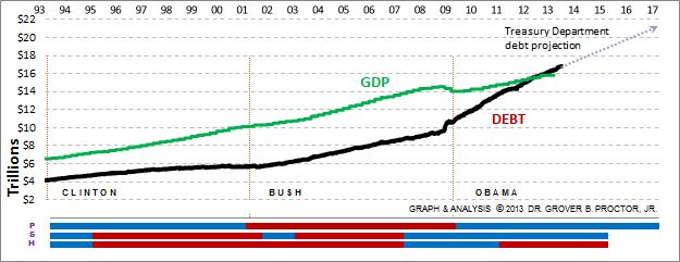
T H E D E B T T O D A Y On April 2, 2013 the National Debt ticked past $16.8 Trillion for the first time ever. On January 30, 2012 the National Debt exceeded the country's Gross Domestic Product for the first time since just after World War II. How much is $16.8 Trillion?
G R A P H I N G T H E D E B T The black line on the graph above maps the Bureau's 5,089 day-by-day data points, showing the movement of the Debt from January 1993 until now.
The green line maps the U.S. Gross Domestic Product, as reported quarterly by the Department of Commerce's Bureau of Economic Analysis. At present, our National Debt is 105.4% of GDP. The blue and red lines at the bottom of the graph show the years that Democrats and Republicans were [P] in the White House, [S] a majority in the Senate, and [H] a majority in the House of Representatives. The three vertical dashed lines show the inauguration dates that began the Clinton, Bush, and Obama administrations. While the reader may draw whatever conclusions seem warranted about the political issues raised, nevertheless the graph plainly demonstrates some economic facts worth noting. First, the rise of the National Debt leveled off at the end of the Clinton Administration's and the Republican's Congressional "Contract With America" efforts to balance the budget toward the end of the 1990's. It began to rise again (and GDP flattened out) in the aftermath of the attacks on September 11, 2001. Also, by contrast, GDP declined as National Debt rose precipitously following the economic meltdown in late 2008. D E B T A N D T H E P R E S I D E N C Y According to the U.S. Debt Bureau, the National Debt has risen $ 4.0 Billion each day on average since the inauguration of President Obama. This compares to $ 1.7 Billion each day on average for the Bush administration, and $ 0.5 Billion each day on average for the Clinton administration. Here are some additional facts about the National Debt in the last three Administrations: Clinton: The National Debt during the 8 years of this administration rose $1.5 trillion (+36%). It should be noted that in the last year of the Clinton administration, there was a net $23 billion reduction in the debt. Bush: The National Debt in the 8 years of this administration rose an additional $4.9 trillion (+86%). Obama: The National Debt so far in this administration has risen from $10.6 trillion to $16.8 Trillion (+52%). If Obama is re-elected and the prediction of the Treasury Department comes to fruition, the National Debt will have at that point increased by 84% in the first six years of his administration. ( NOTE: The above graph shows a slight anomaly in the 107th Congress 2001-2002. For the first five months of 2001, the Senate had 50 Republicans and 50 Democrats, so Vice President Cheney (R) broke the tie. As this had the effect of giving the Republicans a majority, the Senate is shown above as red for that period. However, effective June 6, 2001, Sen. James Jeffords (R-VT) switched to Independent status and announced that he would caucus with the Democrats. This gave the Democrats a one-seat advantage, so from that date until the end of 2002 the Senate is shown in blue. ) |
DATA FROM:
| |||||||||||||||||||||||||||||||||||||||||||||||||||||
| UPDATED: 17 APRIL 2013 | ||||||||||||||||||||||||||||||||||||||||||||||||||||||