IDEOLOGY: Americans Define Themselves as Liberal / Moderate / Conservative
|
Analysts and pundits of various political persuasions are currently citing polling data that shows how Americans classify themselves — Liberal, Moderate, or Conservative. The "spin" put on the data depends on the philosophical allegiance of the commentator. As usual, the real story lies somewhere in the middle.
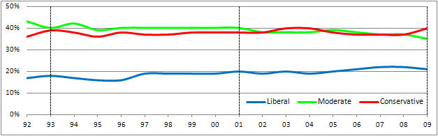
Here's the truth of the matter. The Gallup Organization recently reported 18 years of historical data, collected in 1992 through 2009, resulting from their asking Americans "How would you describe your political views — very conservative, conservative, moderate, liberal, or very liberal?" The graph above shows the longitudinal results of that poll, with the two types of conservative collapsed into "Conservative" and the two levels of liberal merged into "Liberal."
There is good news for both Liberals and Conservatives in these numbers.
Conservatives: For the 18 years of this data, Conservatives have greatly outnumbered Liberals, from a high ratio of 2.4:1 (1996) to a low ratio of 1.7:1 (2007-2008). In 2009 the ratio is 1.9:1, close to twice as many Conservatives as Liberals.
Liberals: Whereas both Liberals and Conservatives show a increase of 4 percentage points (at the expense of Moderates) in this period, in terms of people, Liberal numbers have actually grown 24% compared to only 11% for Conservatives.
The graph provides dashed vertical lines to show the periods of President Clinton (Dem; '93-'01) and President G.W. Bush (Rep; '01-'09), bookended by the last year of President G.H.W. Bush (Rep; '92-'93) and the beginning of President Obama (Dem; '09).
( Gallup reports that the sample sizes for the annual reported percentages ranged from approx. 10,000 to approx. 40,000. Thus, it is with 95% confidence that one asserts the margin of sampling error to be ±1%. )
|
| |
1992 |
2009 |
NET |
|
| Liberal |
17% |
21% |
+24% |
| Moderate |
43% |
35% |
−19% |
| Conservative |
36% |
40% |
+11% |
| | | |
Graph created and analysis written by
| DR. GROVER B. PROCTOR, JR. |
DATA FROM:

|
PARTY: Americans Identify Themslves as Democratic / Republican / Other
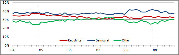
In addition to being asked to identify their political ideology (above section), pollsters have asked Americans to state the political party with which they identify themselves. As is evident from the movements of the lines on the graph above, Party "affiliation" is far from a static, unchanging statistic. And as both the Ideology and Party graphs show, there is no one-to-one mapping of ideology and poltical party.
For example, it is evident that not all people who call themselves "Democrats" (most recently 37.5%) also call themselves "Liberals" (21%). It is not clear, however, whether the reverse is true.
Maybe the most striking thing revealed by the Party self-identification polling occured at the time of the two national elections which took place during the time period of these data. (The dates of these elections are marked by vertical dashed lines.) Note the following:
| • | In the run-up to the 2004 election (in which Republican President Bush was re-elected), the number of those calling themselves "Republicans" bumps up against the number of "Democrats." (The ambiguity over whether the poll reflects more Democrats or more Republicans can no doubt be explained by sampling error.) Nevertheless, it would appear that this trend was a good two-to-three-month leading indicator of the eventual outcome of the election. |
| • | Similarly, the run-up to the 2008 election (which elected Democratic Senator Obama to the Presidency) saw the number of those calling themselves "Republicans" (a) was at a low culminating from a decline that occurred between 2005 and 2007, (b) remained relatively flat during the time, and (c) was considerably lower than the number of "Democrats" (which pushed above the 40% mark at the time). Once again, perhaps this provides a relatively accurate leading indicator of the election results. |
| • | At the time of both elections, there is a decided dip in the number of those calling themselves "Other." In both cases, however, that number seems to rise back up to previous levels soon after the election. |
It will be interesting to see if the above "leading indicator" dynamics accurately predict the results of the next Presidential election in the months running up to the November 2012 election. |
Highest and Lowest Percentages
Reported For Party Affiliation |
|
| PARTY |
Max |
Min |
|
| Democratic |
41.7% |
35.9% |
| Republican |
37.3% |
30.8% |
| Other |
32.9% |
24.1% |
| | |
Graph created and analysis written by
| DR. GROVER B. PROCTOR, JR. |
DATA FROM:

|
|